Thursday 26 November 2009
Project Evaluation
This project has been very enjoyable despite the sometimes stressful moments with the 3D programs and the notion that I may not actually finish the project. All in all I was pleased that my renders somewhat resembled my original concepts. The most important thing however was how much experience I acquired and that I learnt so much using these 3D packages. I believe I even improved my techniques in photoshop too. The other crucial skill I think I improved in was design. I believe I successfully understood the process of how a concept becomes something more than just a concept, but a model that can be navigated through either virtually in a game or physically if the 3D model is built as a set for a film.
Exterior Chop-Shop 3D Render (Complete)
Below is the render of the chop-shop exterior model. I am particularly pleased the way this render turned out as it is very close to my original concepts. Again I did use photoshop to enhance and tweak the render itself. The red light and glow was added after the render. I also made the textures such as the logo, bay number and hazard stripes less overpowering. The shadows were in places far too dark near the bulkhead door so I decided to lighten up the entrance area. I also added a lens flare to give a sense that it was an exterior in space. I was pleased that my textures turned out better than I expected. The scratched metal paneling textures give a real sense of how the exterior was constructed and that it has weathered over time. I believe I achieved that contrast between the industrial exterior to that of the smart clean interior.


Interior Chop-Shop 3D Render (Complete)
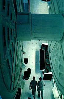
I found this image below of a screenshot of the gravity ferris in 2001: a space odyssey on the internet. I wanted to use this image as reference for textures and lighting within my renders using lightwave. At this point I had succeeded in improving the appearance of the robotic arms, the crane and the vehicle which I was particularly proud of. These were probably the components that turned out to be the best models I had created during this project.
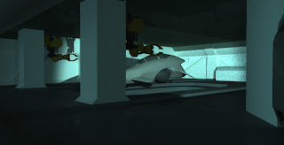
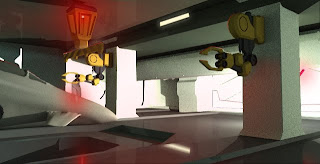
 The render below came out particularly well and was my favourite out of all the other renders just because of the mood that is conveyed by very little lighting.It was the closest render that resembled the image above and my original concepts. I attempted to render off additional lighting by adding the red glow of the crane light and the soft ambient light of the strip lights, however for some reason it was taking for ever to render, literally it would have taken half a week. I was concerned that I was going to run out of time. I was determined to produce a render that did my original concepts justice. So I decided to introduce this lighting by using photoshop over the top of my renders. As you can see the first three renders have no additional lighting. The second and third image below shows the renders where I attempted to introduce a little more light and reflection. These images of course took a lot longer to render simply because Lightwave had to calculate how the light would reflect and bounce around the interior. With these additional renders with reflection I wanted to give a sense that the surfaces were somewhat reflective and clean. I also introduced more lighting so there was more of a contrast between light and shadow in order to portray the space and exaggerate the relief of the indentations on the walls and door.
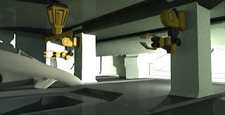
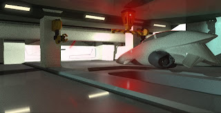
 Below are the renders that are shown above, only here I have added additional lighting over the top of these images. I used photoshop to add the additional, crucial lighting that I believed would make the images that much better and true to my original concepts. As you can see although the photoshop lighting is not a true lighting render, I think I did a good job of making the reflections and glows look like they belonged to the renders themselves. The additional lighting allowed me to express that the surfaces such as the walls and floor are meant to be somewhat reflective. Notice that I also added the hazard stripes texture on to the crane beam as I has forgot to apply the texture before these renders.
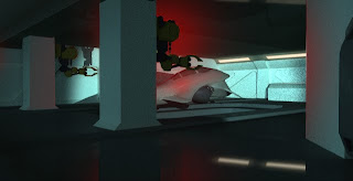
 The render below came out particularly well and was my favourite out of all the other renders just because of the mood that is conveyed by very little lighting.It was the closest render that resembled the image above and my original concepts. I attempted to render off additional lighting by adding the red glow of the crane light and the soft ambient light of the strip lights, however for some reason it was taking for ever to render, literally it would have taken half a week. I was concerned that I was going to run out of time. I was determined to produce a render that did my original concepts justice. So I decided to introduce this lighting by using photoshop over the top of my renders. As you can see the first three renders have no additional lighting. The second and third image below shows the renders where I attempted to introduce a little more light and reflection. These images of course took a lot longer to render simply because Lightwave had to calculate how the light would reflect and bounce around the interior. With these additional renders with reflection I wanted to give a sense that the surfaces were somewhat reflective and clean. I also introduced more lighting so there was more of a contrast between light and shadow in order to portray the space and exaggerate the relief of the indentations on the walls and door.

 Below are the renders that are shown above, only here I have added additional lighting over the top of these images. I used photoshop to add the additional, crucial lighting that I believed would make the images that much better and true to my original concepts. As you can see although the photoshop lighting is not a true lighting render, I think I did a good job of making the reflections and glows look like they belonged to the renders themselves. The additional lighting allowed me to express that the surfaces such as the walls and floor are meant to be somewhat reflective. Notice that I also added the hazard stripes texture on to the crane beam as I has forgot to apply the texture before these renders.


Wednesday 25 November 2009
Chop-Shop Occlusion Renders (Maya)
All the images below are occlusion layer renders of my chop-shop model in Maya. When I attempted to render these images with the ceiling on, the render came out completely black. I assumed that the ceiling was interfering with Maya's default lighting, so I removed the ceiling and rendered these images. The occlusion render is a really nice tool which exaggerates the relief of your model. It basically looks the way it does because Maya creates shadows where two or more edges meet. I came across this tool when it was shown in a book and a fellow student explained how to use it. Its great because it allows the viewer to see exactly what the space looks like in terms of structure and design. It also makes your model look crisp, clean and smart. It also seems to make your model 10 times better. The finish is almost like a real foam-board model under soft light.
Here are various views from within the interior chop-shop model.


Monday 23 November 2009
Textures
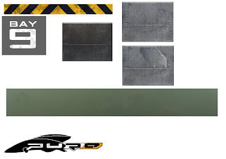
I put various Textures together for both the interior and exterior of the chop-shop.
Below are all the textures I designed.
Chop-Shop Vehicle/ Craft
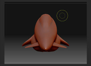
I decided to model the chop-shop interior docked craft in Z-Brush so that I could familiarize myself with this interesting program. I decided to create the craft design in my original concept. I believe that creating such an organic shaped craft would be somewhat easier in Z-Brush. The hardest parts to model were probably the engines, the nose and the fins. I was really pleased the way this model turned out and the fact that it is true to my original craft design. Indeed I chose a challenging model to create but I fell it was worth it in terms of the finished result and the knowledge I acquired when using Z-Brush.
Below are some images of the craft I created.
 Side View.
 Perspective View.
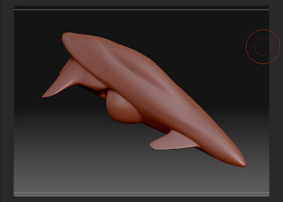
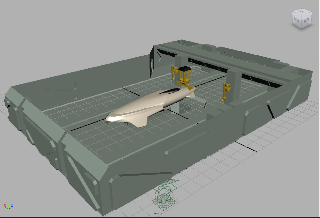
3D Chop-Shop Face & Polygon Models
Below is the 3D model of the chop-shop nearing its final stages before being imported into Lightwave for Texturing, Lighting and Rendering. I was not pleased with the crane, the robotic arms and the vehicle/ craft, so I decided to attempt to do a better job of modeling these particular components in Lightwave by completely re-modeling them.
The modeling process was difficult at first using Maya as this was the first time I had attempted to create a design of my own properly. I wanted to push myself and learn how to model in Maya and familiarize myself with most of the important tools and functions. To begin with the program was daunting, confusing and hard to get along with, but I was determined and got on with it. Books and tutorials did help me greatly as did tips from fellow students. I was not comfortable with lighting, texturing and rendering in Maya, so I decided to use Lightwave which is a slightly more familiar program in terms of navigation. In addition Lightwave's rendering is somewhat faster. I exported the model from Maya as and .fbx file which could be read by a 3D program called modo. This file format could then subsequently be altered to a LW .obj file.
Below are a couple of images of the 3D model of the interior design for the chop-shop.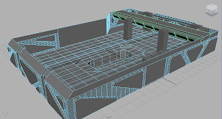

Below are a few images of my exterior design for the chop-shop. Here the model is presented with faces/ polygons so that its structure and volume is visible.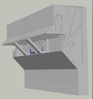


Below are a couple of images of the 3D model of the interior design for the chop-shop.


Below are a few images of my exterior design for the chop-shop. Here the model is presented with faces/ polygons so that its structure and volume is visible.


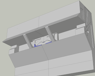
3D Chop-Shop Wire Frame Models
Below are a couple of simple wire frame images of both the chop-shop exterior (top) and interior (bottom) models. I used Maya in order to create these models and I am happy that they turned out quite well. They are also very close to what I had originally planned.


Thursday 5 November 2009
Spacecraft Designs (Reference/ Inspiration Material)
I was surfing the Internet and I came upon these amazing futuristic vehicle designs. Perhaps I could attempt to build a futuristic vehicle of my own in 3D using these as inspiration/ reference and incorporate it in my chop-shop.


3D Chop-Shop Model
Now I shall begin to create the interior and exterior of my futuristic chop-shop design in a 3D programme.
Final Chop-Shop Exterior Compilation
Here are all the components which show how my ideas gradually developed and ultimately resulted in the final exterior design of the futuristic chop-shop.


Final Chop-Shop Exterior Perspective Colour Concepts (Complete)
Here is the final chop-shop exterior design in three different states. The exterior will be exposed to deep space which is why I have added a completely black background. I have also tried to experiment with differences in lighting. The first concept on the left depicts the chop-shop hangar bulkhead when closed. The second concept depicts the chop-shop hangar bulkhead fully open exposing the anti radiation and harmful light reflective protective screen. The idea is that the occupants within the chop-shop are protected and thus can still appreciate the wonders and spectacles of space. Looking through this screen from outside is impossible due to the highly reflective surface. However when looking from within the chop-shop the view is crystal clear. The third concept on the right depicts the exterior of the ship in deep space where absolutely no light is present. The chop-shop hangar is fully open and the protective screen has not been engaged, therefore the interior of the workshop can be seen through the thick airtight glass hangar door. The idea is that the hangar opening is comprised of three layers. The bulkhead hangar door made of a steel/ titanium alloy is the layer which is on the outside of the ship. The protective screen is the layer in between the bulkhead door and the glass airlock door. The glass airlock door is the layer which is closest to the core of the frigate.
.jpg)
.jpg)
Final Chop-Shop Exterior Perspective Tonal Concept (Complete)
Below is the chop-shop exterior I was most happy with. I have applied a tonal texture to the original perspective line drawing. I wanted to have a contrast between the pristine interior of the chop-shop workshop and the dirty/ weathered exterior of the ship. I have also tried to include the random paneling to the exterior to show how the ship was made and to create an industrial look. I have even added the chop-shop logo.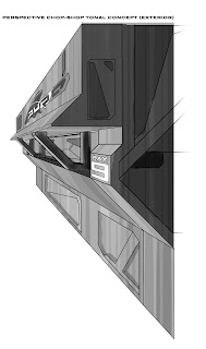.jpg)
.jpg)
Chop-Shop Exterior Bulkhead Concept
Below are some images I used for inspiration and reference.


I came up with a bulkhead design for my chop-shop. I had numerous ideas for bulkhead designs, however the design below was my favourite as it is simple and industrial. The design should be quite simple to create in a 3D modeling programme.


Initial Chop-Shop Exterior Ideas
I wanted the exterior to have a design much like this image below. It is simple and modular and what is interesting is the random placement of paneling which enhances realism and also possesses an industrial quality.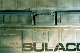
Below are some more refined perspective line drawings of three different chop-shop exterior designs. My favourite chop-shop exterior design is the drawing to the far right. Initially I wanted the exterior to be relatively simple however, I felt that the two initial ideas were a little too bland and uninteresting. I wanted to push myself and create a design which enabled an opportunity for interesting lighting.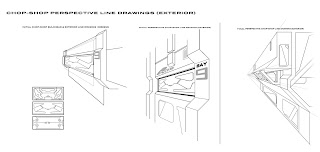
Below are some more refined front elevation (exterior) line drawing and tonal diagrams using Photoshop.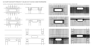


Below are some more refined perspective line drawings of three different chop-shop exterior designs. My favourite chop-shop exterior design is the drawing to the far right. Initially I wanted the exterior to be relatively simple however, I felt that the two initial ideas were a little too bland and uninteresting. I wanted to push myself and create a design which enabled an opportunity for interesting lighting.

Below are some more refined front elevation (exterior) line drawing and tonal diagrams using Photoshop.

Here are various sketches of the exterior of the chop-shop. These were very quick sketches of ideas for the front and perspective elevations of the chop-shop as well as bulkhead designs.
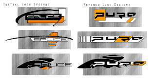
Chop-Shop Logo Designs
I thought it might be an idea to come up with some sort of Logo for my Chop-Shop. I wanted to give my chop-shop an identity even if it's activities are illegal. Just for fun I came up with a few ideas. From the start I wanted the logo to be Dynamic and Futuristic. I started with the name "Splice" as a reference to DNA splicing. The idea behind this name was to suggest that the vehicles or craft were being altered or even repaired with different parts. However I felt this name was ultimately unsuitable as a chop-shop involves a vehicle being dismantled for salable parts instead of being either altered or repaired. Thus I looked up the word "refined" in the English Oxford Thesaurus. Several different words which meant the same thing were listed such as polished, rectified, filtered, distilled & processed. However the word that stood out the most was "purified" or "pure". This word had far more weight to it and suggested that the vehicle was being purified into salable components. So I chose the word "Pure" as the name for my futuristic chop-shop. I did look at various font designs for titles from games such as Wipeout. Indeed the name "Pure" is somewhat of a nod to the wipeout franchise as one of the game titles was "Wipeout Pure".

I also downloaded a few cool future fonts such as Decoder, 399 Missile, Dominator Black, Intergalatic Veloudrome, Neutronica, Prologik & Futuremark. I experimented with all of these fonts however I felt that Futuremark suited my ideas far more than the rest.
I also had a good idea of what I wanted for the colour scheme for my logo design. I wanted to use the colours used on the alien weaponry in the recent film "District 9". These colours were Orange, Black & White.
Below are my own designs for the chop-shop logo. The logo that I am most pleased with is the design to the bottom right.

Chop-Shop Exterior (Reference Material)
Below are various science fiction concepts and designs that I managed to find on the Internet. I can use these images and perhaps merge them with contemporary designs so as to create entirely new designs.


Subscribe to:
Posts (Atom)
